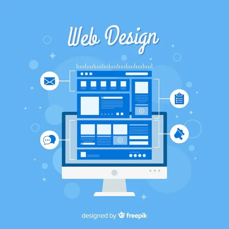
Creating an effective web app design is essential for any business looking to increase productivity and efficiency. By following the 10 best practices listed below, you can create a user-friendly interface that meets the specific needs of your users. From keeping designs simple to using common icons and buttons, these tips will help you make an app that is easy to use and visually appealing.
What is a Web Application?
Web applications are interactive programs that run on a remote server instead of locally like regular software. They can be accessed through an Internet connection and often have more features than traditional desktop applications. Desktop applications work on computers and need software installation, whereas web applications are designed to work across many devices, from smartphones to tablets.
Some examples include Airbnb and Spotify, which allow you to interact with them through your browser without needing installation on the device. Web apps are a great way to access information from anywhere. They’re also very popular because you can use them on your phone or tablet.
What is Web App Design?
Web application design is a key component in the overall process of building your web applications. The look and feel will be decided during this stage, including UI/UX designs, graphic production content, or any other aspects depending on what you want.
The design stage of a web app includes many factors, but the most important one is its User Interface (UI). The UI is what you see when using your application and involves both graphics and text.
Design patterns are a powerful tool for solving problems in software design. As a result, they have been used to create some of today’s most popular programs, including Android and iOS smartphones.
Role of UI / UX in Web App Development:
UI is the part of your web application that allows users to interact with it. UI can be broken down into elements such as buttons and colors on a page or font styles for text input fields – everything you see when browsing an internet browser.
UX Design is all about making sure that your application brings the best experience for users. A UI/UX designer will focus on the ease of use or user satisfaction when using the site or app in question – even down into details like speed & responsiveness time.
Importance of Web App Design:
Web application design is important for the success of your company. A well-designed app can help you make a strong first impression on potential customers and increase conversions. It also makes navigating easier, which means more efficient use by end-users. We care about our clients’ satisfaction (which vanishes quickly without good UX), which helps with SEO rankings.
Web design is a delicate balance between form and function. The right combination can boost your business’ bottom line. Still, you must know the 10 most essential web app best practices that are as follows:
The Best Practices for Creating an Effective Web App Design
1. Consistent Branding:
A web app’s design is important to this industry’s success and longevity. Unfortunately, many sites lack consistent branding, making them stressful and confusing for users and potential customers.
The best way to set your business apart in today’s competitive market is by keeping its branding and colors consistent across all digital media elements. This includes websites and social media profiles or print materials like logos that can be seen with customers on the street or, even worse yet-in person.
When designing a website, use only the prescribed brand colors and logos. Remember that your story should be evident across every page of this site – from images to videos or typography choices for text across the app.
2. Attractive Home Screen Logo:
Creating a unique and catching icon is the key to success regarding your web application on Home Screen.
When designing your app’s logo, consider the screen size it will eventually appear on.
3. Include Custom Splash Screen:
Splash screens are designed to make users feel like they’re getting straight into what you’ve got. A splash screen (also called boot or launch) lasts 2-3 seconds and displays some branding before an app loads. It makes your web app look more like a native application.
The logo or motto of the company can be displayed on a splash screen to increase brand visibility. The user’s interaction with Progressive Web Apps is even more engaging when they see this message before opening an app for the first time.
4. Focusing on User’s Attention:
With websites providing both static and dynamic content, some user interface aspects attract more attention than others. For example, images are much catchier than text – just as sentences marked as bold will always be seen better when they’re looking at them rather than reading through an entire page or article for information on one topic alone.
Video advertisements are highly distracting and annoying for the human eye, but from a marketing perspective, they work well. This is because video-based adverts have the edge over other types of web advertisements. It takes seconds to recognize patterns or motions, which helps us pay attention to what’s being advertised.
Focusing on specific areas of your site with moderate visual elements can help visitors get from point A to B without thinking too hard. The fewer question marks they have, the better sense of orientation and trust in what you’re representing as a company will grow; in other words: reduced thought needed means increased user experience.

Freepik
5. Focus on Feature Exposure:
Users of modern web designs are often critical due to their approach that guides you through the site with visually appealing 1-2-3 – step processes, large buttons, and other elements. But from a design perspective, these guidelines aren’t bad because they make it easy for visitors by leading them through content in simple steps.
Showing the user what functions are available is an important principle in successful interface design. It doesn’t matter how this works, as long as users know they can find their way around and feel comfortable with whatever system there may be present at any given time.
6. Effective Writing:
The Web is unique compared to print media because it requires a creative writing style that considers users’ preferences and browsing habits. Users will not pay much attention to reading promotional content. Long text blocks without images or keywords marked in bold/italics will likely go unnoticed by readers; exaggerated language can result from this lack of engagement on their end, so avoid overuse if you want users to read your article.
Company names are important for establishing brand identity. They should be simple, informative, and professional to project the image you want your company or startup to have.
It is best to keep it simple. Use short, concise phrases. Keep your layout scannable by categorizing content and visual elements like headings levels or lists that break up uniform text blocks. Be objective about why people should use your offer – don’t sound too advertisement-like.
7. Simplicity is Best:
When designing a site or an app, remember that users are not there for the design; they want to get information. So instead of striving towards complexity or distraction, strive toward simplicity and offer only what’s necessary, making your pages easier on their eyes.
Good site design is important for the user experience. The best way to provide a good User Interface seems seamless in this day and age. But many different aspects make it great, including font choice & size, color palettes, and the whole visual equation – everything about how you see what’s on your screen from the start till finish.
8. Include Testimonials:
Nothing can replace the input of real clients, from a testimonial to feedback. A single review builds trust in your prospects with current customers, and it’s here where you need cautiousness when overpopulating websites because ricocheting may occur. The rule for this thumb says that 4-6 reviews should be monitored closely organized into digestible blocks on our website.
9. Using Human Illustrations:
Human illustrations are everywhere. They’re an integral part of many web applications, and you can choose various styles for your designs.
Dynamic graphics are a perfect fit for web applications because they allow content to be easily customized with the click of a button.
The output tone should remain professional while still including excitement about how dynamic solutions can spice up any design.
10. A/B Testing:
A/B testing is an extremely popular way to compare web pages and see which one performs best for a given goal. This could include assessing how effective your call-to-action (CTA) button or headline was, what colors of images produce more engagement from users on social media sites like Facebook, etc., and any other metrics you might consider when designing websites.
Conclusion:
The best web app designs are visually appealing and easy to use. By following the 10 best practices we’ve outlined, you can create an effective and user-friendly design.
The web app design principles and examples covered in this article are a great place to start when creating or updating your website. However, remember that it’s always important to test your designs with real users to get feedback and ensure the experience is smooth for everyone. Our team of developers will take care of your web application development needs and make sure it’s everything you expected.

A fun-loving, creative, and passionate writer. Experienced as a curriculum writer for kids at CompuSkool (Information Technology) written interactive learning materials that engaged young minds between 3 to 17 year olds across different technology areas. After a break from writing, now pursuing passion through blogging. Now a technical writer at Squash Apps. Waiting for the future to reveal itself as days unfold.


