Introduction
Ecommerce UX trends are great news for ecommerce stores. The means of people interacting with the outer world is constantly changing, and e-commerce is evolving, recently accelerating the COVID-19 epidemic. The task of modern e-commerce websites is to close the gap between how people shop today and what they expect in a digitalized future economy. The best way to do this is to install the latest ecommerce web design trends to help e-commerce stores become more contentious, helpful, and competitive. We look at what is being done as a customer experience, whereas shop owners need to make the store more attractive, approachable, focused on different things, or anything that can accentuate our unique marketing proposal. This issue claims that UX retail design is not just a satisfying thing to have, but it does require you to have a deep part in managing the digital business. The visuals should align with the business strategy and recent trends in online shopping, as users desperately want and need to see a business that they can trust and understand. Mobile users shop online for various reasons: fast, easy, less stressful, offers a wide range of options, and, because of the variety of special deals, is often less expensive. But the owners can only obtain great customer report with a good Minimalist design. This article concentrates on top UX trends that aid in Ecommerce for apparel.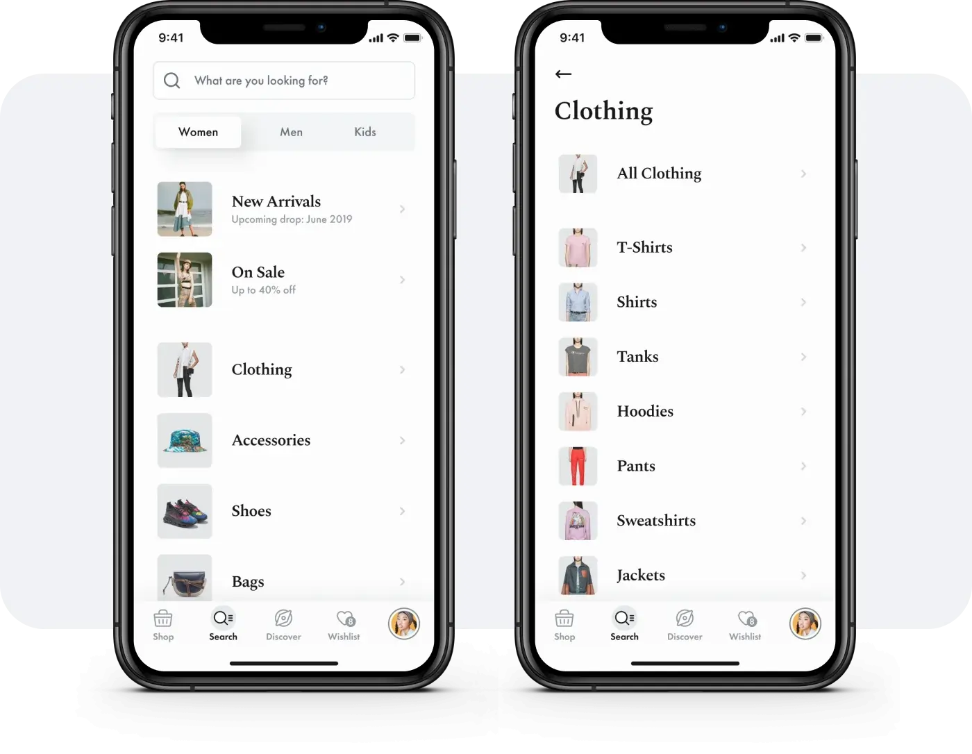
Ecommerce UX trends
Ecommerce has been more popular today than ever before, unlocking the doors to new ideas and new styles. Many of the 2021 ecommerce design trends diverge or challenge the traditions of the past, and online retailers now have more opportunities to showcase their ingenuity and style, which ultimately improves usability, branding, and customer experience. Therefore, mobile users shouldn’t miss this opportunity. Create your ecommerce site differently than your competitor and gain a lot of new visitors looking at your site for the first time; if all goes well, it will not be their last. If you want to sell online in the mobile app, you can’t just rely on your products to sell themselves. You will have to provide a good user experience (UX) which makes it easier for people to buy and encourages them to buy regularly. UX is important for ecommerce because it ensures that your customers can easily navigate your website, find what they need, buy it, and move on. And if you make it easy for people to buy from you, they will always buy. That’s why you should make sure your company offers the best UX possible. Smartphones have been on the rise in the market, connecting users in a way never seen before. This development alone proves the need for a better mobile web design. Users have also been placing more stock on mobile browsing quality, significantly affecting website visitors’ stay and customer business views.
Top ecommerce UX trends for Apparels
Almost all eCommerce sites rely on a similar series of page tracking in the sales process for the Apparel buyers.- Plain home pages with unlimited value propositions
- The well-organized section pages are easy to view.
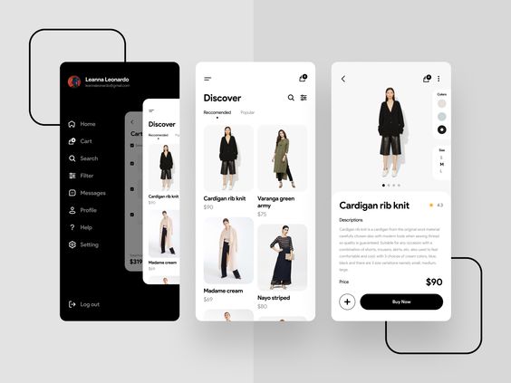
- The polished product pages include proof of social media and compelling content.
- The trouble-free checkout process shows continuity and makes consumers feel secure.
- Each page layout, content, and navigation help consumers find the information they want while bringing them closer to shopping. All four pages must work together to create unparalleled eCommerce consumer preferences.
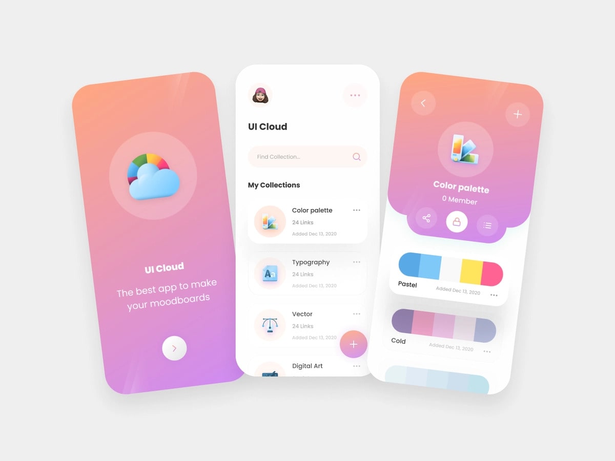
 On average, for every $1 spent in website UX, the company can expect a return of investment up to $100 as per UX Planet, 2020. A good UX design increases a website’s conversion rate up to 200%. 80% of consumers are willing to pay extra for a better user experience. Mobile sites are about visuals (on the user interface). These should be a bold representation of your brand and your target audience. This interface supports your UX. Accordingly, The UX trends are listed below.
-
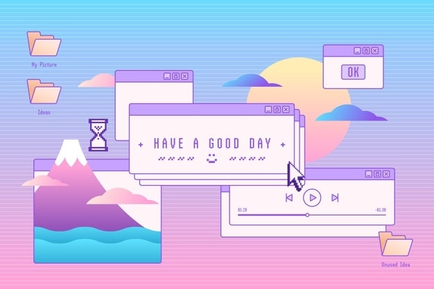
Vaporwave aesthetic
-
Multidimensional designs
-
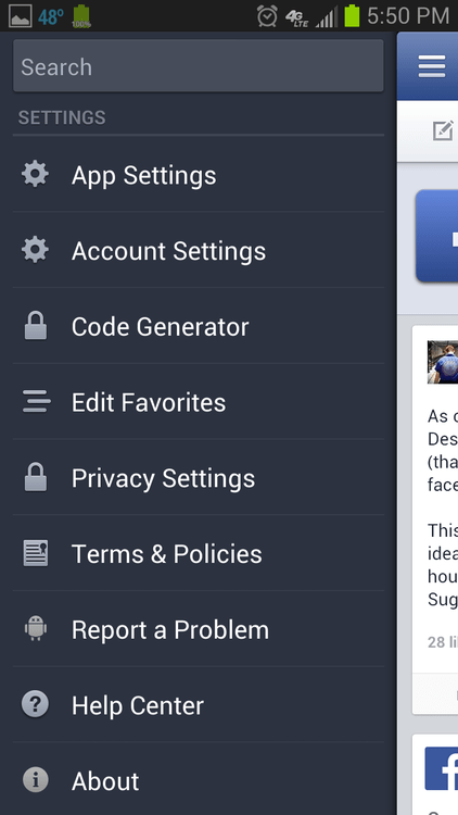
Customer interactions with the product
-
Animate transitions

-
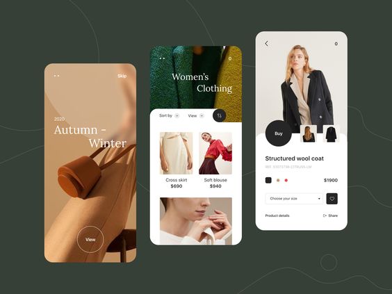
Feed product characteristics in the design
-
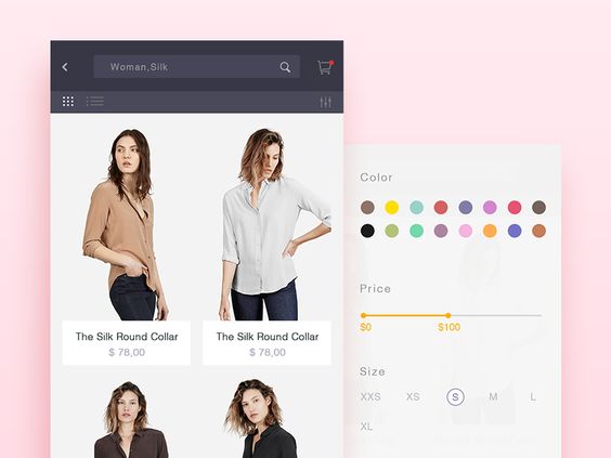
Favorable filter processes
-
Silent background-color
-
Brightening up

Mobile/UX Design growth
Mobile devices dominated the Internet, surpassing traffic from desktop computers. This thing has led businesses to look into mobile web design in the hope of gaining a piece of this emerging market. According to StatCounter, 2020, 48.62% of users access the Internet via mobile devices. Mobile web designers are now considering features such as loading times and UX services to meet the expectations of these users. Companies can also apply best practices to inform customers positively. As per Hubspot, 2020, About 93% of people will leave a website if its pages do not display properly on their devices. The same percentage of people (93%) will leave the website if the pages do not load fast enough. In addition, 90% of users will leave the website due to poor design. Want more conversions? Then make sure your user interaction and user experience design are up to standard. Investing in this is sensible because it gives people what they want and needs. And it makes it even easier for them to be loyal followers of your product.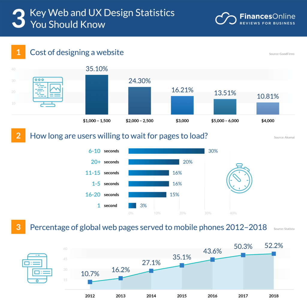 People are more likely to inform their friends if an online shopping site disappoints them. It turns out that they, too, are eager to get as far away from it as possible. Once you have failed your customers, they will not stay with you for long, so it is best to start making changes immediately. 99firms, 2021 says that about 94% of users’ negative feedback is on design. 90% of consumers will continue to shop by type if they have good information about its website. Users do not respond to ads because they rarely appear to see them. Instead, their attention is focused on other aspects of the site. 89% of customers will jump on the competition website if they encounter bad website user information, as per Ledgeview Partners, 2020.
Conclusion
Remembering the importance of UX keeps you focused on the needs and feelings of users while designing your site. Taking the time to complete the UX design early will save you time and money over time.
Harsini has been a person who is heeded by Science and Technology. She has agility for creating engaging creative writings and SEO content that help companies achieve their marketing goals. She always had an interest in fine writing which can be seen from her writings that bring out creativity through words incorporating some facts! Harsini has provided Communicative English training to help individuals articulate better. She loves to tour and learn about new cultures, and she is always up for attempting new things. She is a dog lover, and she has adopted a puppy. She is working to understand the broadest sense of nature and pursue Science while aspiring to become a healer.

