Introduction
Previously, we did not focus on web applications the way we should, and now it is time to look at some useful tips and application interface design solutions that make web applications easier to use and more efficient. Many apps these days are migrating to the web. Despite the limitations of the platform or installation requirements, the software-as-service model looks very attractive. At its core, the design of a web interface, the Web design focus is dependent on UX/UI design process. The benefits of good design in User-interface are to provide easy, accurate, and responsive user interactions that allow users to make things happen with minimal effort and time competing with desktop applications.
This blog focuses on 7 Effective Web App Interface Design Tips for Businesses.
Web App Design
You have certainly used many web applications if you are an Internet user. Airbnb, НubЅроt, Spotify, DoorDash, Canva are all web app design examples. Web applications or web apps are interactive software programs. Instead of computer-based programs running locally on the end user’s machine, they run on a remote server. People shall access them via a web browser with an Internet connection.
Actions such as using your laptop computer to check your email, shop online, or access your bank accounts may involve web applications with clean design. The web application design process is important for building a web application. It focuses on interface elements and the look and feel of a web app. The design stage includes many features.
Web app interface design in software engineering has five main components: User Interface, Usability, Content, Creativity, and Accessibility. Each of them is important in your journey to build a great web app where customers will become familiar with your services. You may require hiring the best UI/UX designers for your web app design.
User Interface (UI)
The user interface is a picture frame for a web application. The UI contains color palettes, fonts, images, and other features users interact with a web application. All visual elements must combine in beauty and functionality utilizing a user interface design cycle. They should be suitable for a web application and a representative brand.
The most important task of UI designers is to create an attractive visual interface that is accessible and designed for potential customers.
In a world where people have more than 1.8 billion websites they can potentially visit, you need to ensure yours is not just a beautiful yet responsive design.
User Experience (UX)
UX is a process followed by designers to develop services and products that ensure a good user experience. The process should be simple and easy, giving customers the impression that they have finally got what they want. How easy or complex it is to interact for a user determines user experience.
Tips for Designing a Business Web Visual Connector
#1 Specialized Controls
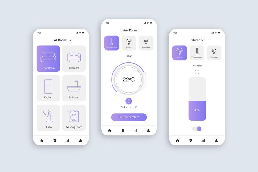
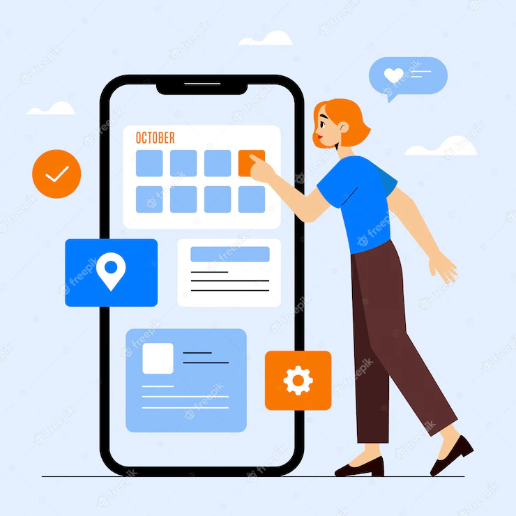
People can handle different situations differently, and some controls are better at their intended function than others. Using the daily, month, and year drop-down lists, you can select a date. However, the dropper does not work very well than the calendar selector, where you can click directly on the desired date.
Calendar options also help you see dates, weeks, and months (especially working days and weekends) more easily and allow you to make an informed decision faster than you would with a simple drop-down list. You can enter a number manually, but slide controls do a much better job in certain situations.
#2 Disable Press Buttons
One of the problems web applications face with forms is the submission process. If you click the “Submit” button with two or more simple forms quickly, the user will submit the form twice. It is problematic because it will create duplicates of the same thing. Preventing duplication is not very difficult, and it is important to do this in many web applications.
There are two levels of this protection: the client-side and the server-side. We will not go beyond server-side protection here as this will vary depending on the programming language and background settings. You must check a submit to ensure that anything sent is not a duplicate and block it during the processing.
#3 Shadows Around Windows Modal
Put shadows next to pop-up menus and windows that are not just eye-candy. They aid in the menu or window standing out from the back by enhancing its size. They also block content noise under the window by darkening the surrounding area with shadow.
This process has its roots in traditional desktop programs and helps users to focus their attention on the pop-up window. Since most modal windows are not easy to distinguish key content such as desktop applications, shadows help them appear closer to readers because the window appears three-dimensional and over the entire page.
#4 Using empty states to motivate users
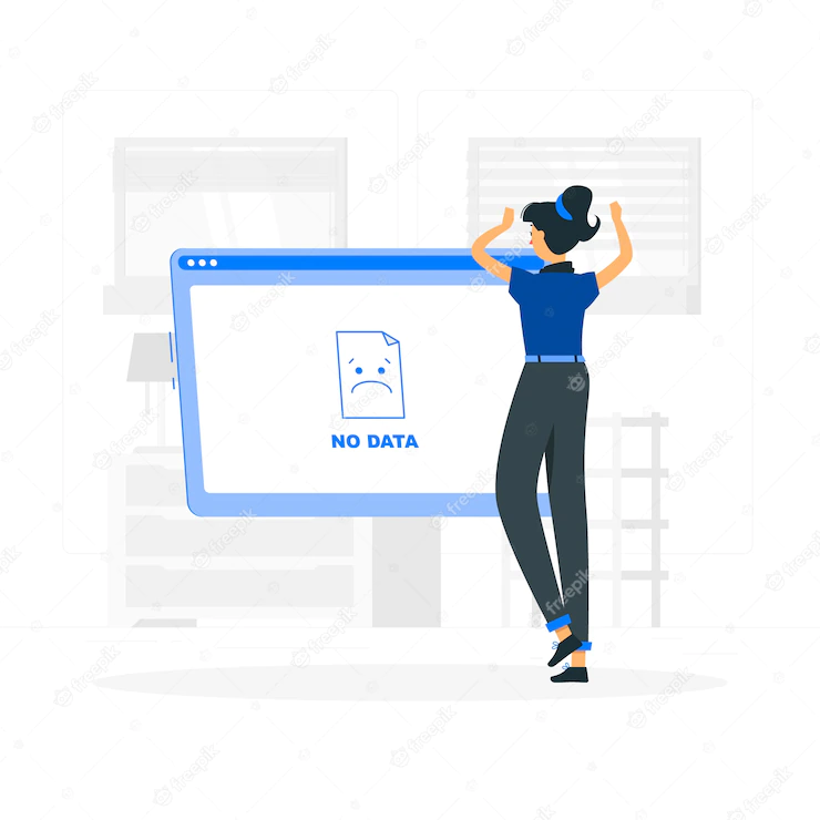
If there is no page information or query yet, a useful message can tell the user how to get started can enter that space. For example, the homepage of a project management plan may include a list of user projects, but you can link to the project creation page if there are no projects yet.
This process encourages users to try the service and continue directly using the service after registration. Guiding the user with one step in the app can help him understand what benefits the app offers and whether it is useful or not. It is also important to present the most important options for the users – it does not make sense to overwhelm them with too many options. Remember that users often want to get a solid idea of what they are given, but they don’t require to go into details – they have no time or interest in it.
Using practical situations to motivate users and keep them active, you can significantly reduce the amount of “drop-outs” and help your potential customers better understand how the system works.
#5 “Pressed” view
Most Web applications have customized buttons. These are anchors or plug-ins with custom images assigned as their background. The default input keys may not be appropriate in some cases, and the text links are sometimes very hidden. The challenging part is, while you make your links look like buttons, they have to behave like buttons – and this counts having a “pressed” look when a user clicks on them.
It’s not just a visual tweak. Giving quick feedback to the user will make the app feel more responsive and bring a sense of experience to the user experience in desktop apps.
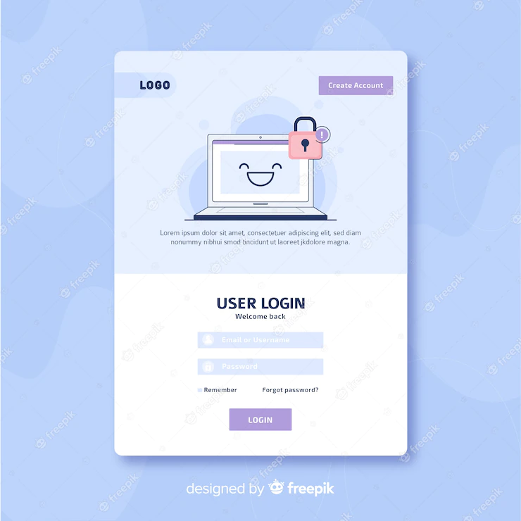
#6 A registration link to your login pages
Some people who have not yet registered for your application will end up on the login page. They may want to try your request but can’t find a signup page right away. Perhaps they have tried to access a feature only available to registered users.
These people can make things easier by posting a signup link on your sign-in pages. If they do not yet have an account, they should not request a registration page.
#7 Sensitive context controls
It is important to think about what the user expects to see and what they need in every particular context. You do not need to display the same ubiquitous navigation control with complex web application design because users may not need them in all cases.
One of the best examples of sensitive control contexts is the recent change in the Microsoft Office 2007 interface, where the ribbon controls have replaced the default set of toolbars. Each tab in the ribbon contains different controls related to a specific task, be it graph editing, error checking, or just typing. Web applications can also benefit from those context-sensitive controls because these controls help to limit communication by displaying only what the user needs, not everything available.
Conclusion
A well-designed web application will aid you in making a strong first imprint on potential customers. Great web application design also obliges you in boosting leads and supplementing conversions. But, more remarkably, Modern web application design makes it easier for your users to navigate and use your web app.
We are the best app developers and UX/UI designers in India & USA. Contact us to build or enhance your web application strategies!

Harsini has been a person who is heeded by Science and Technology. She has agility for creating engaging creative writings and SEO content that help companies achieve their marketing goals. She always had an interest in fine writing which can be seen from her writings that bring out creativity through words incorporating some facts! Harsini has provided Communicative English training to help individuals articulate better. She loves to tour and learn about new cultures, and she is always up for attempting new things. She is a dog lover, and she has adopted a puppy. She is working to understand the broadest sense of nature and pursue Science while aspiring to become a healer.

